


New Guest Blog - Liane Payne
 Yellow House Art Licensing
Introducing our guest blogger for 2016, Yellow house artist Liane Payne. An experienced designer with a wealth of experience, as both an illustrator and previously art director at Simon & Schuster, we are looking forward to Liane sharing her insights over the year.

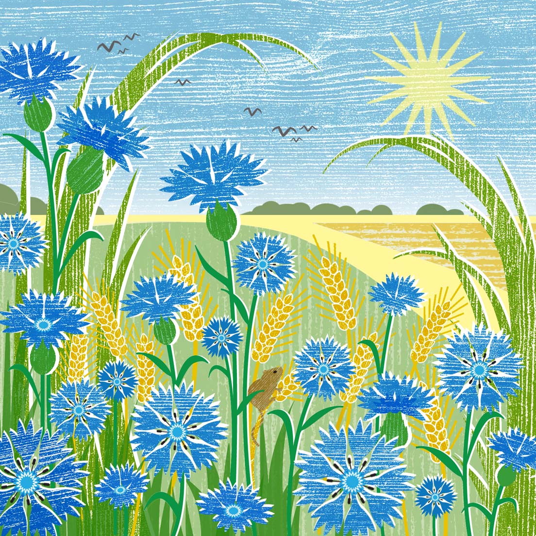
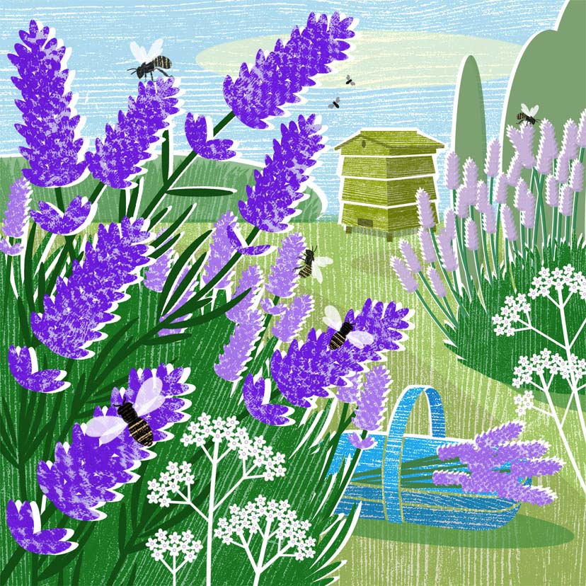
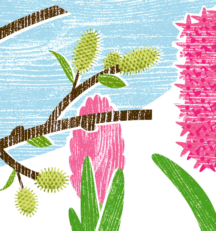
Liane is a very versatile illustrator working in several distinctive styles, but her woodcut work, combining traditional printmaking techniques with digital processes, is proving to be particularly successful at the moment.
Perhaps it's the beautiful colourways with clear elements which clients are picking up on. The National Trust, Museums & Galleries, Camden Graphics, Almanac, and Woodmansterne have all snapped up her work over the past year. For Liane's first guest blog, we asked Liane to talk to us about the medium, her working methods and what inspires her...
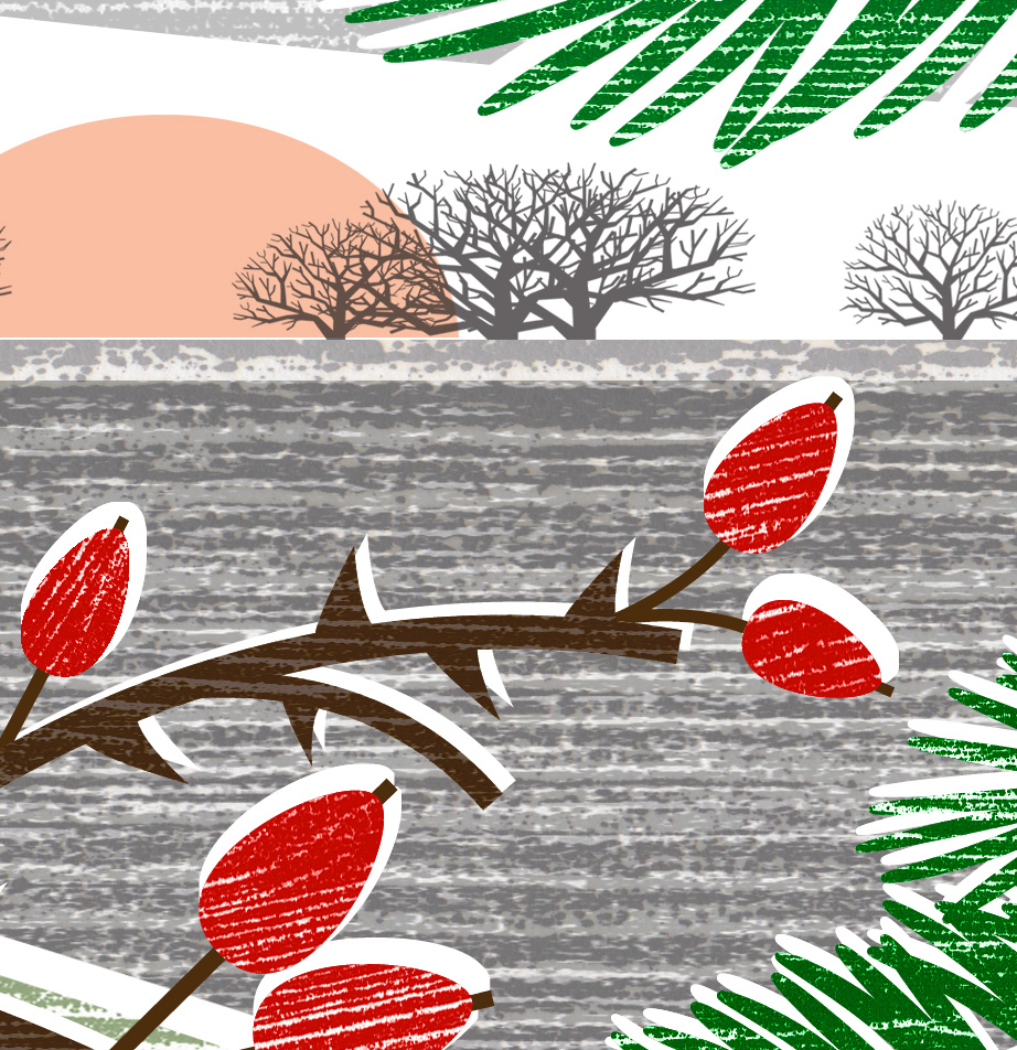
Three images from Liane Payne's 'Wood-cut' range

‘Though most of my work goes through a digital process somewhere along the line, my heart and soul is very much in the analogue realm – my ideas stem from the natural world (a little plant-based pun for you there) and are developed from hand-rendered techniques. My background is in fine art printmaking and the woodgrain images I produce are very much rooted there. I’m interested in texture and surface patterns and wood really presses my creative buttons! I particularly like the contrast of bringing together natural textures with precised computer-generated shapes.
Over the years I’ve built up a huge collection of printed textures and rubbings and it’s these that I use to make my digital collages. It’s a process of creative recycling really. Some of the swatches are offcuts from old lino and woodcut commissions, or they’re from demonstration pieces left over from my teaching days when I used to run illustration and printmaking courses at The London College of Printing.
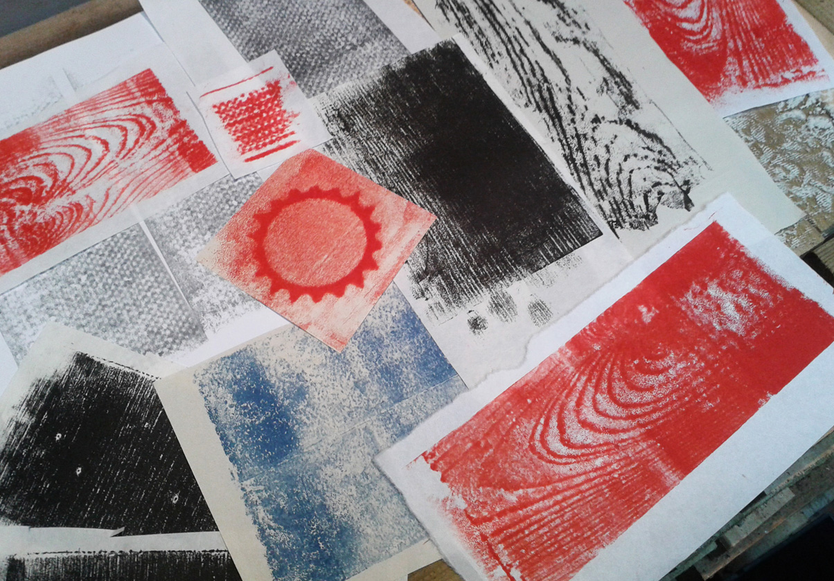
Sometimes I’ll ink up a piece of wood ‘to order’ if I’m after a particular texture for something I’m working on, but quite often I simply collect and create textures with no specific purpose in mind. With or without a precise plan, I always end up with lots of interesting stuff that’s full of exciting possibilities. And the whole process is wonderful – I simply love everything from getting printing ink all over my hands to filling the house with the lovely smell of linseed oil and white spririt! Even the subsequent mechanical process of scanning can throw up interesting ideas; especially when I start to fiddle with colours in Photoshop.
It may be months later that I look through my scans and prints and find a swatch that’s suddenly perfect for a catkin or a ploughed field. Or, on idly rummaging through my collection, a print taken from an old plank may suddenly suggest a landscape and the beginnings of a more finished design...
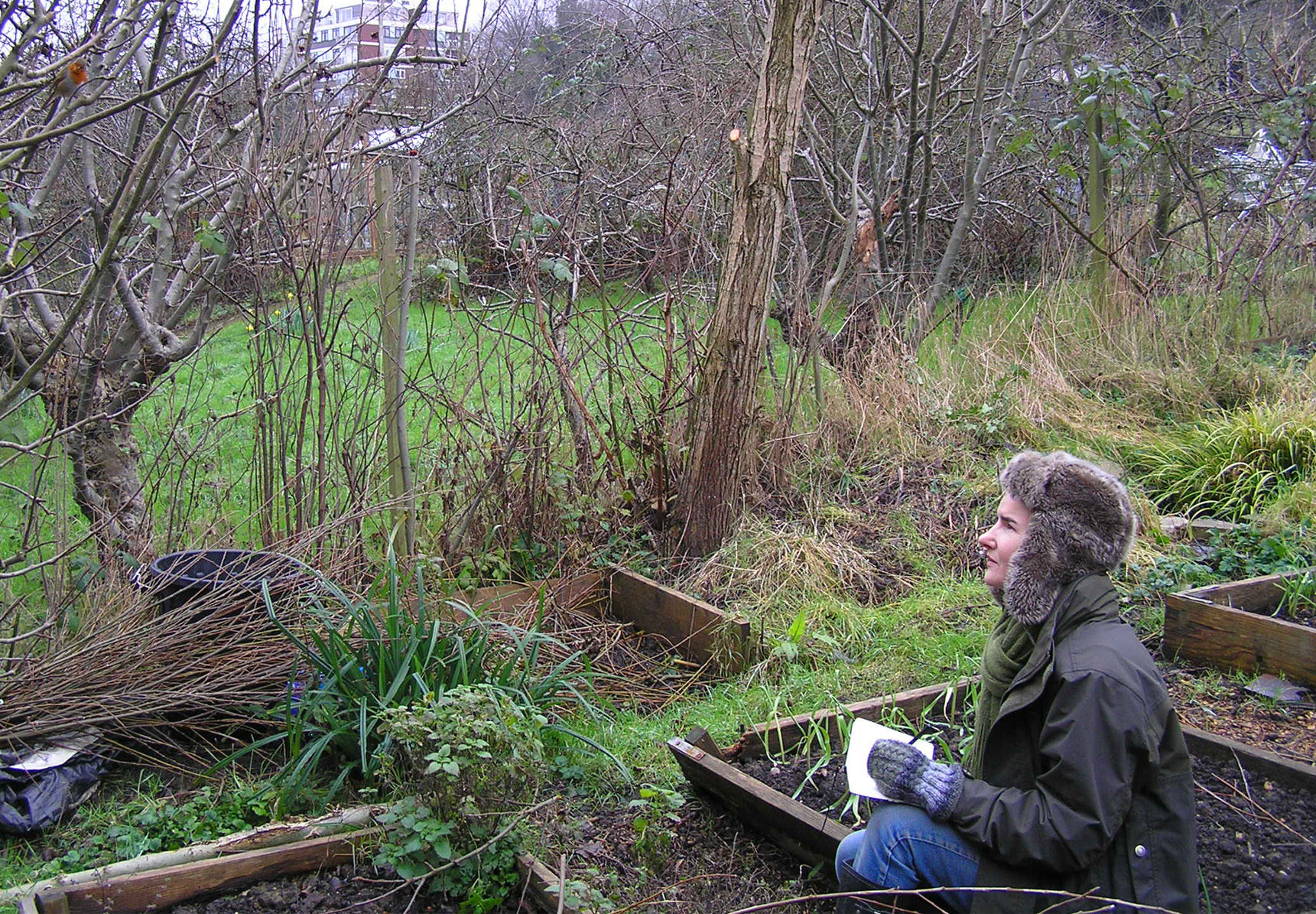
I also source quite a bit of firewood from my allotment, where I have a willow tree which I pollard every year.
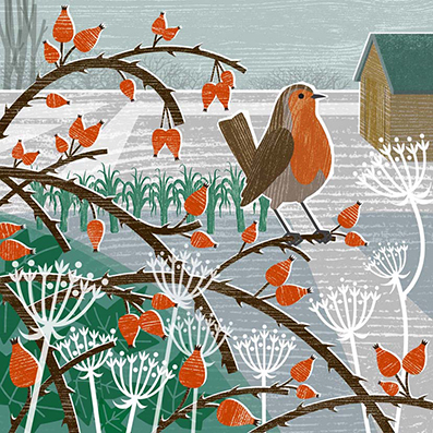

But more importantly, my plot is a never-ending source of inspiration for images. Whatever the weather or season, ideas are somehow handed to me on a plate. Even in the middle of winter there are lovely shapes and textures to look at, and a cheery robin is never far away...
Winter is such a great time of year for me to work on images, as once the weather warms up and the weeds start growing, it gets tricky trying to balance all the gardening chores with working as an illustrator!
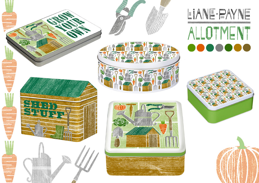
Most recently I’ve been working on allotment-themed ideas for gift tins, using the changing seasons as ideas for different ranges. How lovely if some of these go into production – that shed-shaped tin would be an ideal birthday present for me...’
Guest Blog by Liane Payne, March 2016

;)